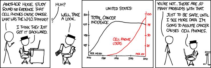
Graphs are often used to show data; they provide a very powerful way to show numerical trends. But graphs can also be done poorly and be misinterpreted.
(Source: http://xkcd.com/925/)
In the comic, the man in the hat has made a graph that shows the incidence of cancer in the United States with the number of cell phone users. The incidence of cancer has been fairly steady over the past 30 years while the number of cell phone users has increased.
This means that cancer causes cell phones, right? The graph shows that there are increases in cell phone users just as the cancer incidences start to plateau, so that conclusion makes sense, or does it?
Is there another–better–way to interpret this graph? What does that graph really show?
Explore how good scientists draw conclusions from data in our High-Adventure Science investigations in climate, space, and water.